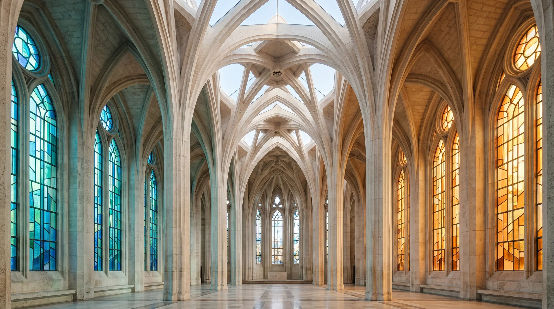
We suggest three ways to look at light and colour in the Sagrada Família: orientation, gradation and materials. They are observations that can inform your thinking without turning a basilica into a technical template for a house.
First, name the artist. In its tribute to Joan Vila-Grau, the basilica credits him with designing the stained glass according to Antoni Gaudí’s guidelines. He began work on the nave windows in 1999. The architecture and stained glass therefore have authors worth distinguishing.
1. Look at colour alongside orientation
The official gallery associates the Nativity side’s bluer tones with morning light. The monument’s booklet describes orange tones on the opposite, west-facing side in relation to evening.
Our advice for a home: do not begin with a colour name. Begin with where you would like to see it and when you expect to enjoy the result. You might prefer a very understated everyday atmosphere and reserve another intention for particular occasions.
We do not derive a “blue in the east, orange in the west” rule for your project from the monument. We see an invitation to put preferences in context. A colour in a screenshot is a starting point; we recommend also explaining the place you associate with it.
2. Notice where the gradation starts and stops
The official interior booklet describes darker lower glass, increasing transparency above and clear glazing at the central nave’s top. Vila-Grau used different glass textures to follow that intention.
Our takeaway for a design conversation: where you place colour deserves as much attention as which colour you choose. You might want a specific accent without wanting it to occupy the whole composition.
To prepare your ideas, take a photograph and mark the area where you imagine colour being present. Leave the other areas unmarked. This is not an installation plan; it is a way to show us what interests you. Our interior lighting page can help you continue that conversation at the scale of your spaces.
3. Bring materials into the conversation
The same booklet identifies sandstone, granite, basalt and red porphyry among the column materials, contributing different colours and textures to the interior.
Our preference is to discuss an intention with the project’s actual materials in front of us. An inspiration photograph can express an atmosphere; it cannot decide what you will enjoy on your stone, wood or paint.
We therefore recommend preparing a few finish references and asking to compare proposals in their intended context. Explain what you want to retain about the material’s character: its presence, its subtlety, its contrast with something beside it. Your vocabulary does not have to be technical to be precise.
That preparation can accompany an exterior lighting project too. For us, the connecting idea is straightforward: describe the result you want on a material and in a place, rather than a colour in isolation.
Common questions
Who designed the stained glass discussed here?
The basilica credits Joan Vila-Grau, following Gaudí’s guidelines. Work on the nave windows began in 1999.
Is this a demonstration of LED lighting?
No. This article draws on the stained glass, light and materials described by the basilica. It does not compare their operation with a residential system.
Do I need several colours for my project?
Not necessarily. We suggest defining a colour’s place and role before deciding whether you want one or several.